Which install sources bring customers who keep what they buy?
An app growth team can tell you cost per install to two decimals. Very few can tell you what share of those customers cancelled or returned the order. We joined a retailer's MMP data with their ERP order status at order level, and the answer moved budget.
The question the client actually asked
It was not an analytics question. It was a budget question, asked in a planning meeting:
“We are buying installs across a dozen channels. Are we buying them from the right ones? Do we need more installs, or better installs?”
Cost per install answers neither. Neither does in-app revenue, because in a retail app a meaningful share of orders never becomes revenue: they get cancelled before shipping, or returned after delivery. A channel can look efficient on install cost, acceptable on gross revenue, and still be the worst channel in the account once the order lifecycle closes.
Nobody had that number, because the number does not exist in any single system. The MMP knows which channel brought the customer. The ERP knows which orders survived. Neither knows what the other knows.
What we joined, and how
Two sources, matched at order level.
From the MMP: install source, campaign, platform, and the attributed order identifier for every in-app purchase event.
From the ERP: the status of every order, split into three states that matter separately. Sold, cancelled, returned.
The match key is the order identifier, and this is the step where these projects usually fail. Commerce platforms typically carry two identifiers, the storefront order number and the ERP order number, and the MMP only ever sees one of them. We confirmed the mapping on a sample before running anything at scale. Match rate came out at 98 percent, and the unmatched 2 percent was excluded from the denominator rather than quietly counted as clean.
Three decisions shaped every number that followed:
Order level, not revenue level. Return rate here means the share of orders that were cancelled or returned, not the share of revenue lost. Revenue weighting hides the pattern, because high value orders behave differently from high volume ones and the question was about channel quality, not basket size.
Cancellations and returns counted separately. They are different failures. A cancellation usually means stock, price or payment friction, or a customer who never really intended to complete. A return means the product arrived and disappointed. Averaging them into one number destroys the most useful signal in the dataset.
“Non-cancelled” as the base filter, not “completed”. Orders sitting mid-fulfilment are real orders in analytics terms. Filtering on completed status alone understates volume and inflates the rate by several points.
What came out
Channel quality varies far more than channel cost

The account average sat just under 20 percent of orders cancelled or returned. Individual channels ranged from 11 percent to 38 percent.
That spread is the finding. A 27 point gap between the best and worst source, on the same catalogue, in the same period, with the same fulfilment operation behind it. Nothing about the product explains it. The difference is who the channel brings.
The worst performers shared a shape: programmatic retargeting on Android, and Google Ads App Campaigns for Engagement. Both were cancellation heavy rather than return heavy, which points at intent rather than product disappointment. These are customers who tapped, ordered, and changed their mind before anything shipped. The cleanest performers were Apple Search Ads and the loyalty programme, where the customer arrives with a product, or a reason, already in mind.
Worth noticing that the two Google Ads app campaign types sit at opposite ends of the chart. Install campaigns, ACI, are among the better sources. Engagement campaigns, ACE, aimed at people already on the app, are the worst. Reported as one line under “Google Ads app”, they average into something meaningless.
The same holds inside one programmatic network. Same vendor, same creative, same catalogue: Android at 38 percent, iOS at 17. A 21 point gap that nobody sees while the channel is reported as a single row.
The channel that generated the most orders was not the channel that generated the most kept orders. That single sentence was the whole meeting.
The same category behaves differently on each platform
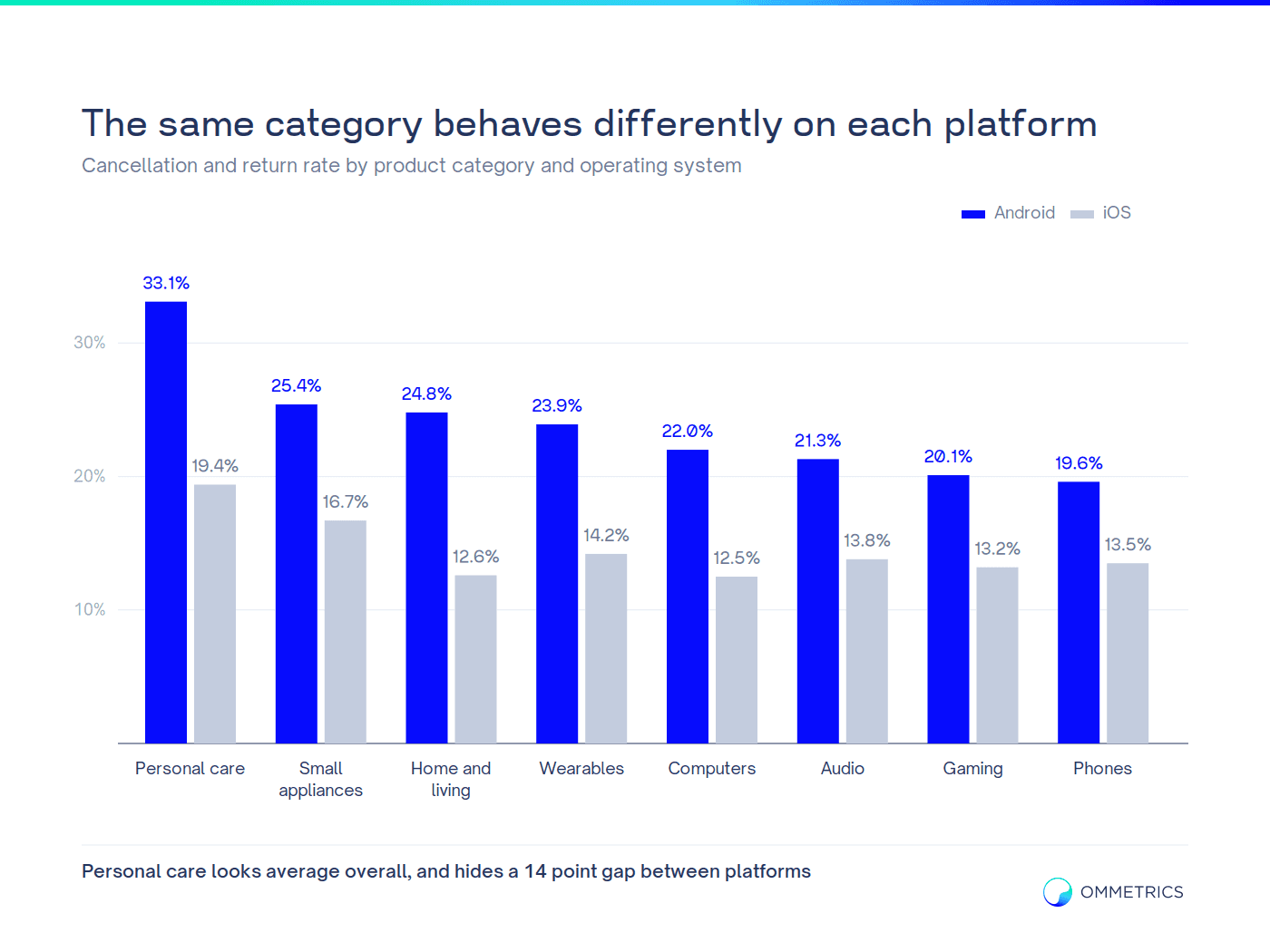
Splitting by platform produced a gap that held across every category: Android orders were cancelled or returned considerably more often than iOS orders, roughly ten points at account level.
The interesting part is that the gap is not constant. In one personal care category the platform difference was close to fourteen points, while in phones it was six. A category that looks average in the aggregate can be excellent on one platform and a problem on the other.
This is what turns the analysis into a decision. The question stops being “should we spend more on Android” and becomes “which categories should we push on which platform, through which channel”.
The category is not the smallest useful unit
Once the platform split was in place, the obvious next question was whether the category is the same thing. It was. Inside one personal care category, individual products ranged from 12 percent to 42 percent, a 29 point spread under a category average of 24 percent.
The pattern was not random. The products at the top were the ones a customer cannot judge from a photograph: colour variants, fit, finish, anything where the box arriving looks different from the listing. The products at the bottom were the ones with a specification the customer had already decided on before opening the app.

This is where the join starts paying for itself twice. The same table that ranks channels ranks products, and the two cross. A channel that looks mediocre overall can be the best channel for the products that never come back, and the campaign team can act on that without asking anyone for an export.
Marketplace and first party fail in different ways
The retailer sold both its own inventory and third party marketplace inventory through the same app. Their headline rates were similar, and their composition was the opposite of each other. First party orders were cancelled more often, third party orders were returned more often, at roughly three times the rate.
One is an operational problem, the other is a product and seller quality problem. A single blended KPI would have reported both as “about the same” and pointed at no action at all.
What changed
The findings did not produce a dashboard. They produced four decisions.
Budget moved away from the two worst channels rather than being scaled with them, since their volume had been read as success. Targets were set per channel rather than per account, because holding a search channel and a retargeting channel to the same efficiency number is meaningless. Category and platform pairing entered campaign planning, so the categories with the widest platform gap stopped being promoted equally on both. And supplier and brand level reporting was added, because the same join answers which suppliers are fed by which acquisition sources.
Then it stopped being a project

The analysis ran once as a question. It runs every day as infrastructure.
The join now lives in BigQuery: MMP data and ERP order status landing nightly, matched on order identifier, modelled into one table that is net of cancellations and returns. On top of it sit the views the team actually opens, channel quality, category and platform, and the monthly reallocation view.
Nobody exports anything. Nobody rebuilds the match. A channel that launched this week appears in the report the morning after its first order, with its own quality number, next to every other channel. The analysis that took weeks the first time now takes the time it takes to open a link.
That is the part worth repeating: the value was not the finding. The finding aged within a quarter. The value was that the question became permanently answerable.
How we would set this up for you
If you run app campaigns at scale and cannot state your cancellation and return rate by install source, the gap is not analytical, it is structural: your MMP and your ERP have never been introduced to each other.
We build that join as part of Mobile Measurement & MMP and Data Engineering & BigQuery engagements, and use the output inside App Growth Consultancy to set channel level targets. It usually starts with a Measurement Audit, because the join is only as trustworthy as the event data underneath it.
Not sure if your data is telling the truth?
FAQ
Why measure returns at order level instead of revenue?
What if our order identifiers do not match between systems?
Is a 2 percent unmatched rate acceptable?
Does this need a data warehouse?
Are the numbers in this case study real?


